Giles Gilbert Scott

Brickwork

After being given the challenge of taking five consecutive photographs of brick by my friend Sarah a couple of weeks ago. I realised that I haven't talked about brick or brickwork which seemed a little strange considering it has been so prominent within my practice for a couple of years now, and along the way I have been gathering some interesting images of different brickwork where and when I see it so I thought I would share them.....

I want to draw attention to how varied and fascinating this material can be. I think it is often overlooked or unnoticed because we are so familiar with it being used for domestic housing.
It's the oldest building material around it is dug from the ground, brick factories are located right next to clay pits so they can be in close proximity to extract the clay from the ground.

 Different regions have different clays running through, Stoke and Bristol is Red. London clay has quite a lot of lime in it making it yellowy grey. Sussex clay is grey. Every clay has a different quality. Creating various surfaces firing temperatures and coloration's. It's a material that can undergo extreme changes from colour to form it heats up in the sun and cools in the cold. It's incredibly versatile as a building material and allows any scale structure to be built. That's probably one of the main reasons why I'm fascinated with it and continue to be so. 

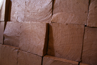
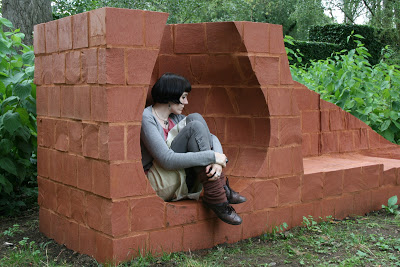
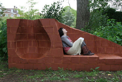
The two images below are examples of my own work fired and unfired brick this is the back of Pause which can be seen in Lady Margaret Hall in Oxford. This is a Cheddar Red brick made in Bristol at Ibstock's Specials Department.


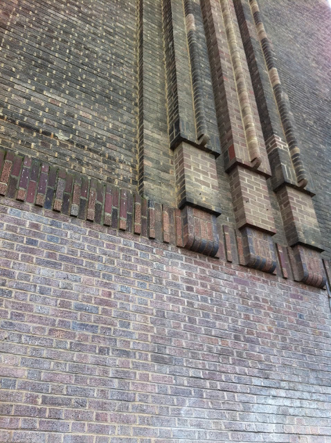
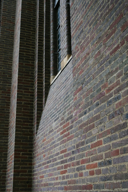
Here is an exquisite example of brickwork and has to be one of my personal favourites Giles Gilbert Scott or known for designing Liverpool Cathedral, The William Booth Memorial Training College on Denmark Hill and Battersea Power Station. Shown below is the facade of Tate Modern on Bankside designed 1947-1960 and comprising of approx 4.2 millions bricks his signature linear design work is unmistakable. 


The three dimensional quality achieved through layering also captures the aesthetic of the period it was designed it represents modernity. Built during a time Specials Departments within the brick industry was thriving. The rounded edged bricks and bullnose bricks would have all been made by hand within moulds.


This image shows Giles Gilbert Scott's work in Lady Margeret Hall Oxford, this beautiful brick building is the colleges chapel. Again it's clear to see the style is reminiscent with the rounded edges framing the long slim windows but what I adore about this particular building is the subtle curve that moves into the elegant bulbous base something we don't often see within brickwork. I think we have become conditioned that brick is straight and somewhat rigid in it's form but that really isn't the case. 


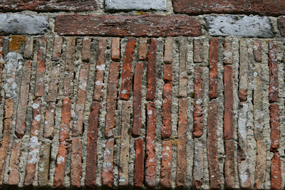
This is a section of brickwork of a church in Romney Marsh these bricks are very narrow compared to the standard domestic brick we are used to seeing today. Mortar can also completely change the overall appearance of a brick in this case they both become equally important to the aesthetic.


Milan quite different in style to much of England's brickwork the small holes within the walls have been created by leaving gaps this has been used in some contemporary buildings as a way of allowing light into the the interior space.


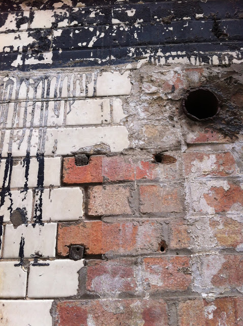
This wall can be found at the back of the Oxo Tower in London. The reason this caught my attention was the bricks looked as though they had begun their life glazed and over time this has eroded away leaving this interesting surface quality of rough and smooth light and dark. 


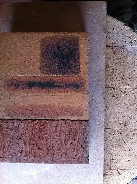
I rescued this collection of bricks from Ibstock whilst working there. The imperfections during firing was the reason they were being thrown away and also the reason they made their way to my studio. They were far to unusual to end up in the bin and the fact they reminded my of Rothko's paintings another reason I gave them a home.


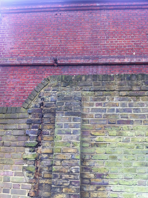
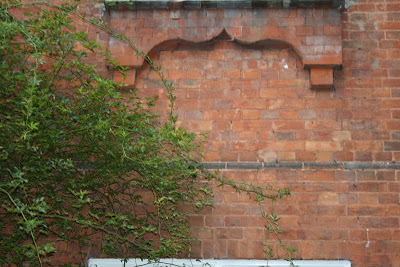
Brick wall in South London 


Three types of brick in South London including this beautiful Edwardian red with bevelled edges. 


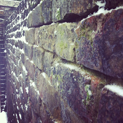
Mossy brick wall in Wapping next to the river.


Red Edwardian brickwork in Lady Margaret Hall Oxford this was one of the reasons Pause had to be made from red brick. In order to create a narrative between site and object.
this college is also rich in different style and age of brickwork.


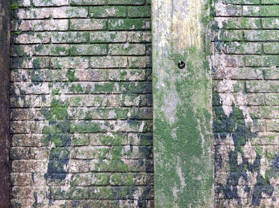
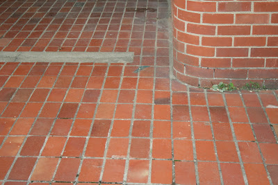
Brick wall and floor 


The new Student extension within Lady Margaret Hall these are contemporary hand made bricks. 


Check out my Pinterest page I have a board dedicated to brick showing examples from all around the world. http://pinterest.com/kimnortondesign/brickwork/

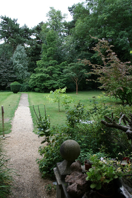
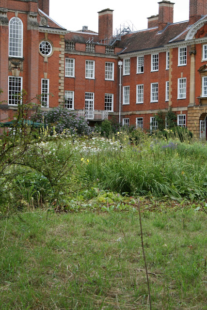
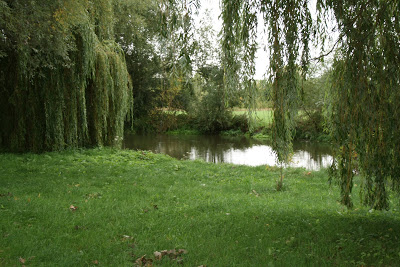
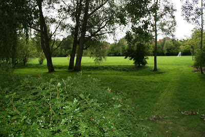
The garden at Lady Margaret Hall Oxford

As it's swiftly approaching a year since I installed Pause into Lady Margaret Hall I wanted to write a little bit about the garden itself. Although there are images on the website I don't think it really captures what the garden is fully about and the clear reasons I selected this site in the first place.


It's probably two years ago I first visited this beautiful space with the intention of finding a site to install my final design. At that point the design had reached a screaming Holt as I needed to understand the context in which it was going to sit. Without the site..... Site specific work cannot exist so the search spanned the entire summer months where most of my time consisted of garden visits up and down the country.


The 12 acre grounds sits at the bottom of Norham Gardens near University Parks in Oxford. The initial view of the college opens up into a traditional formal quadrangle resembling many Oxbridge colleges. As you walk around, there is an entrance on the left hand side which takes you through to something far more unexpected. Throughout this space there is a juxtaposition between the formal and informal. 


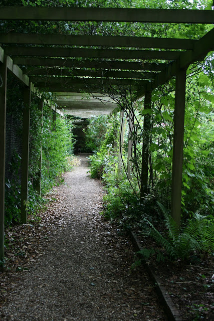
The success of this garden is really down to the vision of the head gardener Ben Pritchard and his team. It clearly resonates that of a creative mind and vision. There are many different routes you can choose as you walk this space and along the way stumble across interesting features planting and seating. Moving from enclosed spaces to open lucid planting unlike the formal settings in most of the colleges closer to town. Lady Margaret Hall has the space to be slightly more quirky with their garden. I think this reflects their more liberal attitude.
 Lady Margaret Hall was the first college in Oxford to accept women in 1878 and has continued be maintain a reputation for being more open minded. That also helped with my decision to approach the college to begin with.


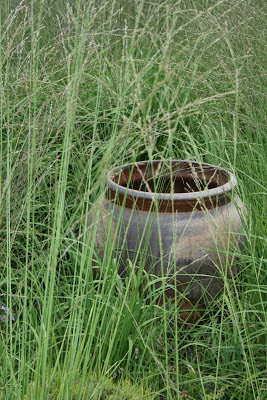
These large stoneware pots sit in the sunken garden made by Sven Byers.


The original buildings instantly became important for me to look at as there was a lot of differing brickwork ranging from early 20th century up to present day with the new accommodation at the back of the site. As I was using red brick there was a narrative immediately developing between site and object.


 The fellows garden is probably the most formal space surrounded by hedging enclosing this area. Hinting at more traditional features through the use of topiary, clean lines, and contained planting.


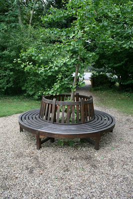
This seat is a memorial to Iris Murdoch who used to spend time in Lady Margaret Hall. I realised as I walked this space that there was seating of various kinds dotted around allowing students and visitors to enjoy the garden. However, there wasn't anything near the Woodland area which in my opinion is the most beautiful spot to be able to take the opportunity to focus a view in much the same way as landscape paintings do.


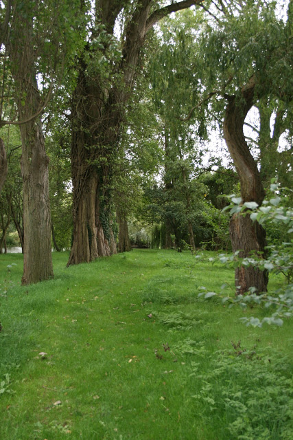
 The woodland area which sits at the bottom of the Fellows garden overlooking the river Cherwell is a lush green space surrounded by trees creating a canopy the quality of light is also stunning I wanted to position Pause so the sun light would hit the secluded seating space mid afternoon during the summer months. In the spring this area is brimming with daffodils and snowdrops. The thinking underpinning this design was to provide a seating space that enabled several people to share the same space whilst maintaining this idea of quietness and solitude. I'd realised that garden seating is often open and flat which makes you feel as though you are simply taking a moment to sit but it feels so temporary and transient. pause has been designed that the dimensions are larger than regular furniture seating which enables you to feel encompassed by the form. subtle nuances are always hinting at this. curves encase you and support the body in several different ways depending on where you and how you choose to sit.


The Chapel fascinated me as the brickwork's darker than most of the other buildings there and the dimension of the brick is narrower and slightly longer in length. Designed by Giles Gilbert Scott in the 1930's I particularly loved the bulging curves leading out from the windows to the base and rounded edges on the brickwork around the windows. The curve was another element that was strongly visible in my early drawings and models. All of these subtle details was building a synthesis between the site, space and design.


Here are a couple of images of the Pause installed. The grass is still recovering from the large hole that was made for the foundations to be laid. It's going to be interesting to see how it changes with the seasons and how it beds in over the next couple of years. 
It's also interesting to think that it will take on it's own identity within the site and everyone will use it quite differently. I recently popped in to take a few photographs in spring and I found a siamese cat sat there on the open seating taking in the sun. Which instantly brought a smile to my face.  


A big thank you to everyone in Lady Margaret Hall especially Ben Pritchard for being so supportive throughout this process he was able to fully visualise my ideas from our initial meeting.