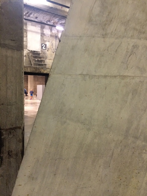
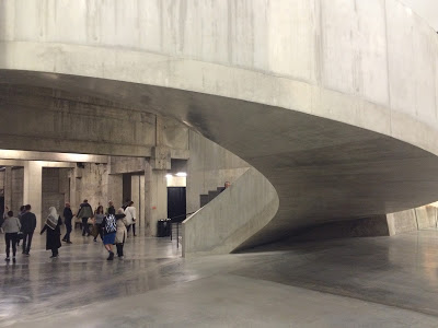
A late summer Sunday afternoon turned out to be the perfect time to visit. For anyone interested in materials, architecture or concrete this new extension is a real treat. As you enter the space from the Turbine room what immediately confronts you is the original wall scarred from it's former function.
With the addition of the elegant concrete stairs you can't help but be blown away by the consideration and skill in construction that has taken place here.
From the outside it is obvious to see the that the extension tapers in towards the top. Where a viewing platform can be experienced on the 10th floor.
Inside there are three main rooms curated according to subject each room has a dedicated floor.
Between Object and Architecture
Performer and Participant
Living Cities
Artists Rooms Louise Bourgeois
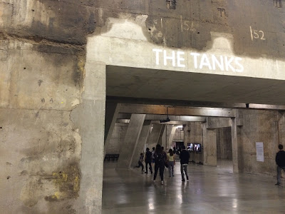
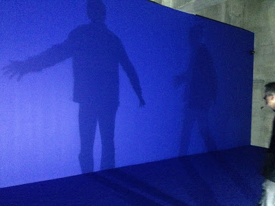
On the ground floor known as The Tanks there is a mix of film and installation.
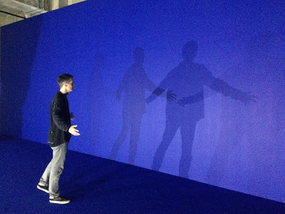
Here's one example.
Dominique Gonzalez-Foerster Séance de Shadow II (bleu) 1998
Between Object and Architecture:
I think it goes without saying that this was the room I had the most affinity with.
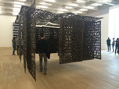
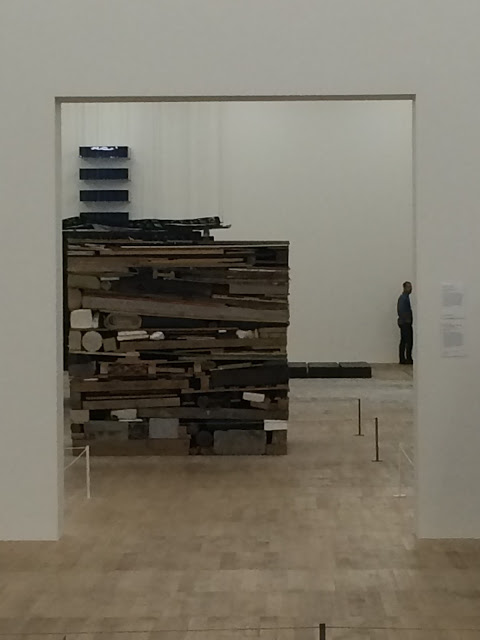
It's material led and the scale of most of the works stood beyond human scale. Showcasing the change of art and sculpture becoming more immersive.
Saloula Raouda Choucair, Infinite Structure, 1963-5 Tufa Stone.
Christina Iglesias, Pavilion suspended in room, 2005 Steel
Tony Cragg
These rooms challenge the viewer, you have to work with some pieces and others force you to physically move beyond the usual standing position.
I found it really inspiring, to see such a diverse range of interesting thought provoking work curated together. Creating a clear dialogue around work created during the 1960's. Minimalism was sweeping art, sculpture, music and architecture.
Art movements were crossing over and experimentation with the everyday object was becoming more prominent.
Performance and Participant:
Performance is something I often struggle with unless it immediately ignites an interest.
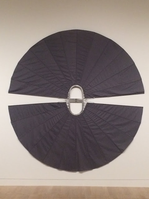
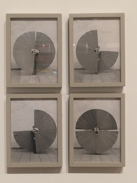
However, what I was immediately drawn to was this collection of works and body pieces worn by Rebecca Horn for her performance Icarus Redeemed 1970-73.
The construction of these structures, the physicality involved whilst manoeuvring them and the elegance and flow captured in the series of photographs below. It has dance like quality to it.
The final comment I want to make about my visit is the lattice style brickwork, constructed as part of the facade of the building, reminiscent of Indian brickwork to allow air flow and light.
In this case I think it's simply for visual impact allowing light to gently glow into the interior walkways. Behind the bricks are glass windows that open and close encased between large concrete beams.
I also noticed that each brick stands on small pads positioned in each corner to hold them in place and also to avoid the use of mortar for a clean finish.
It's a stunning addition to an already breathtaking space. Bringing a focus to performance, live art and installation. During a time where it's so important to support the arts and culture and to bring about a greater understanding how this provides a truly contemporary international view of modern art.

