I am notoriously bad at remembering names and particularly names of artists makers designers until they have made a firm visual imprintation.
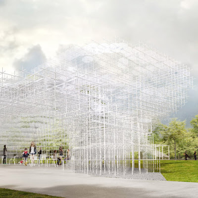
However, I am good at recognising works so when Sou Fujimoto was announced as this year's Serpentine pavilion designer immediately I thought I haven't heard of this architect before !
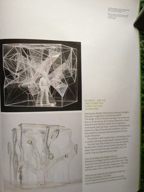
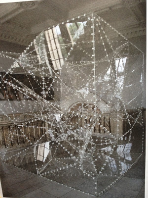
Then I realised that Sou Fujimoto had exhibited inside/outside tree in the exhibition at the Victoria and Albert Museum in 2010 at the 1:1 Architects build small spaces.
An exhibition that looked at spaces being used as places for retreat or refuge once again this was also prominent within my own work during this time so it was fascinating to see how architects had dealt with the subject as they normally work on a much larger scale.
Where smaller spaces require an intimacy.
Cover image of catalogue
I loved this exhibition so much I visited it twice and bought the catalogue....
Once I had reacquainted myself with the work I instantly recognised it.
Inside/Outside Tree was positioned at the top of the staircase outside the architecture gallery and I remember struggling to photograph the structure because I couldn't really step way enough to do the work justice.
Here's a link to design boom where it can bee seen more clearly.
http://www.designboom.com/cms/images/-Z51/sf1.jpg
Image taken from the V&A catalogue copyright belongs to Sou Fujimoto and V&A publishing
Taken from V&A catalogue copyright belongs to Sou Fujimoto and V&A publishing
Taken from V&A catalogue copyright belongs to Sou Fujimoto and V&A publishing
Transparency
Light
Invisibility
and a linear quality to the structure is also evident in both
I think the Serpentine pavilion has such a strong resonance with me right now. I
find myself seeing similarities between some of the key elements Sasha and I are working on within lucid space.
The overall aesthetic is quite different but the ideas and thinking underpinning it are coming from a similar place.
I can't wait to see it in the flesh and experience the space myself in June when it opens. It's going to be such a contrast to the previous two pavilions which have been quite dark and more cavernous.
Image taken from www.dezeen.com


