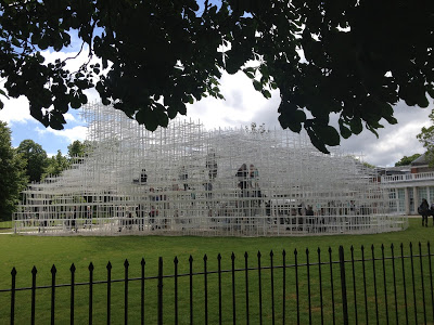
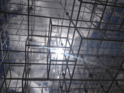
The 2013 Serpentine Pavilion has been open just over a week... I always look forward to this time of the year when the space outside the gallery is transformed for the summer. This year's pavilion has been designed by the Japanese architect Sou Fujimoto.
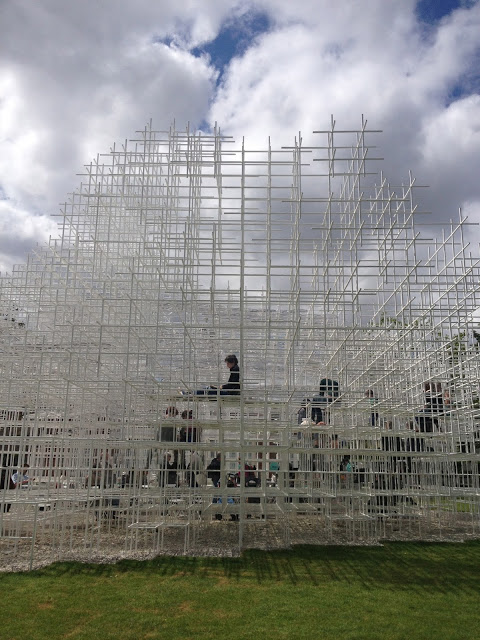
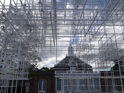
Sou Fujimoto's design is an interesting space that can morph into the landscape it sits. From certain angles it appears to be floating in space, transparent or partially visible. On closer inspection the white steel poles are highly structured and strong.
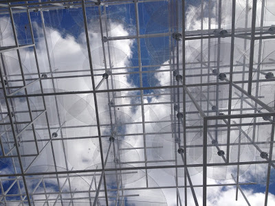
Compared to the last couple of years where Zumthor and Weiwei created quite dark immersive pavilions 2013 shows a departure from the darkness and cavernous qualities evident within the previous couple of spaces. I think I was lucky to have experienced a blue sky the day I visited as one of the best moments was looking straight up towards the skyline through the carefully constructed composition of grids.
As well as the open space in the centre of the pavilion where tables and chairs are available to sit and have a drink, there are glass panelled sections elevated at different heights throughout the space where you can sit and take in the atmosphere, people watch or simply rest for a moment.
Inside the space I would say that there is more formality compared to Ai Weiwei's pavilion last year. My over - riding memory was that there were lots of children interacting with the space and there being an openness to navigate through and around with great ease, the cork interior was soft and forgiving.
This pavilion feels as though it's a space that's more suited to adults.... although it has an ethereal quality to the aesthetic upon interaction it's solid strong and highly structured. The surfaces are hard the steps leading to higher levels are steep because it follows a strict cube format. There is an essence of a complex scaffolding system when you look up into core sections but the whiteness instantly pulls us back into a designed architectural experience.
I really enjoyed this space it felt fresh and liberating I liked the juxtapositions within the design.
Soft and airy vs strong and structured. Being open and closed, inside, outside
the air flow and light it would be interesting to re visit to see how the atmosphere may change in different weather conditions or during the evening in fading light.

