Here we are in the middle of March and the exhibition at Syon Park is looming.
One of the challenging elements of this project is that the exhibition is going to be in a courtyard with a partially covered roof.
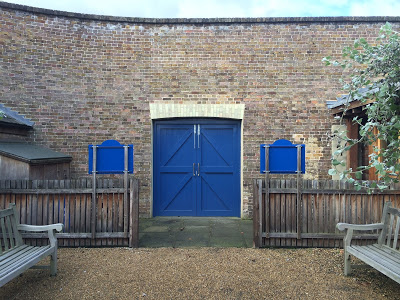
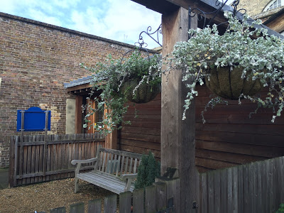
This is the courtyard as it stands right now!
I'm expecting this to be completely transformed in the next six weeks.
The fence is coming down and stud walls are being installed around the edge and back of the space.
This is looking towards the entrance as you enter the visitor centre.
This is the back looking towards the visitor centre, where birch walls will be installed.
So we should be left with a clean airy rectangle to begin work.
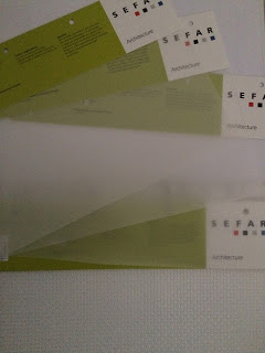
I came across the company Sefar several years ago when Sasha and I were working on Lucid Space.
They are based in Switzerland and produce these super strong architectural fabrics and skins for exterior structures and roofing. So they were my first port of call for roofing solutions. To help Topher's search.
http://www.tenarafabric.com
So taking this into consideration we need to factor in weather conditions and structures that will sustain changes in temperature and our unpredictable english rain.
From the very beginning I've intended to keep it clean simple and open.
Capability Brown's approach to design was forward thinking and very modern for this period in time. He brought about a new english aesthetic and sensibility to gardens in the 18th century and a style that is instantly recognisable as being Brownian.
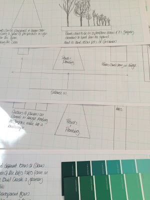
All of these elements seemed relevant whilst designing the floor plan, design layout and the presentation overall presentation.
As usual I started with compiling pinterest boards I find it's easier to gather information together in one place it brings about a sense of focus it also allows a visual style to develop quite quickly.
https://uk.pinterest.com/kimnortondesign/capability-brown-ideas/
https://uk.pinterest.com/kimnortondesign/curation-and-exhibitions/
https://uk.pinterest.com/kimnortondesign/william-curtis-prints/
Here are some wood samples for the walls and plinths It's not a huge space so we need to keep the colour palette fairly light and work with the natural light that will be filtering in.
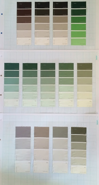
Initial colour samples for the design work.
To see how it works for the general graphics and sits against the wood.
We are really lucky to be working along side an excellent graphic designer Ian Estevens who is currently working on styling the exhibition.
I will begin to filter some of his images through in the next few weeks.
One of the challenging elements of this project is that the exhibition is going to be in a courtyard with a partially covered roof.
This is the courtyard as it stands right now!
I'm expecting this to be completely transformed in the next six weeks.
The fence is coming down and stud walls are being installed around the edge and back of the space.
This is looking towards the entrance as you enter the visitor centre.
This is the back looking towards the visitor centre, where birch walls will be installed.
So we should be left with a clean airy rectangle to begin work.
As for the roofing Topher is researching several options and solutions.
I came across the company Sefar several years ago when Sasha and I were working on Lucid Space.
They are based in Switzerland and produce these super strong architectural fabrics and skins for exterior structures and roofing. So they were my first port of call for roofing solutions. To help Topher's search.
http://www.tenarafabric.com
So taking this into consideration we need to factor in weather conditions and structures that will sustain changes in temperature and our unpredictable english rain.
From the very beginning I've intended to keep it clean simple and open.
Capability Brown's approach to design was forward thinking and very modern for this period in time. He brought about a new english aesthetic and sensibility to gardens in the 18th century and a style that is instantly recognisable as being Brownian.
All of these elements seemed relevant whilst designing the floor plan, design layout and the presentation overall presentation.
As usual I started with compiling pinterest boards I find it's easier to gather information together in one place it brings about a sense of focus it also allows a visual style to develop quite quickly.
https://uk.pinterest.com/kimnortondesign/capability-brown-ideas/
https://uk.pinterest.com/kimnortondesign/curation-and-exhibitions/
https://uk.pinterest.com/kimnortondesign/william-curtis-prints/
Here are some wood samples for the walls and plinths It's not a huge space so we need to keep the colour palette fairly light and work with the natural light that will be filtering in.
Initial colour samples for the design work.
To see how it works for the general graphics and sits against the wood.
We are really lucky to be working along side an excellent graphic designer Ian Estevens who is currently working on styling the exhibition.
I will begin to filter some of his images through in the next few weeks.

